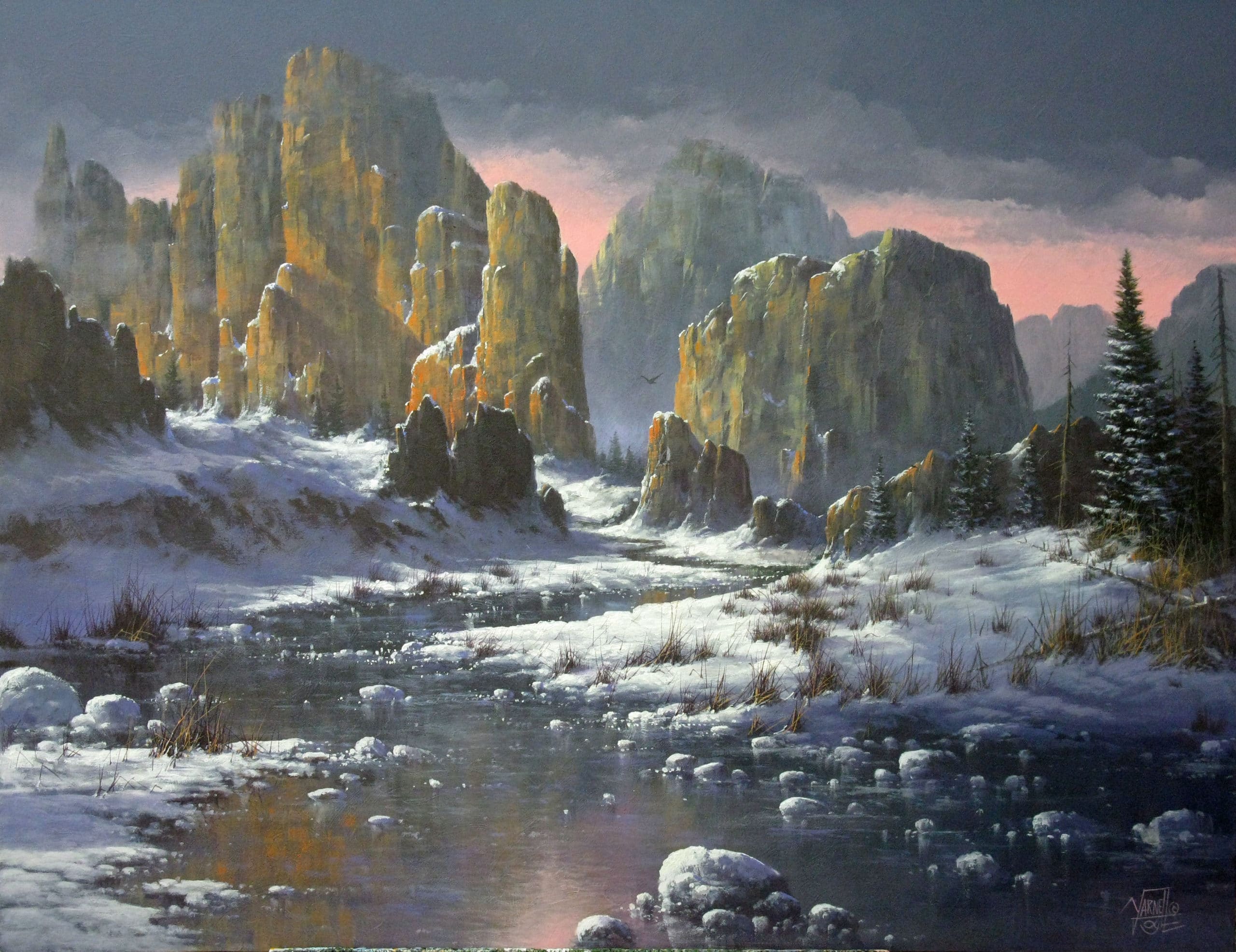
Season – Late Evening
Size – 20 x 24 Acrylic – Horizontal Format
In this beautiful southwest painting of the magnificent vertical rock formations I will be very focused on your ability to have a good balance of cool, warm mix of values and hues in a late evening snow scene! I will specifically be checking your brush strokes for hard edges on the rock formations, soft edges on the snow, clouds, and water plus how well you manage the low back-light. This is a difficult painting so go for it and good luck!!
Value changes – There are multiple value changes from the very background rock formations to the immediate dark water in the foreground so pay attention to those subtle changes.
Recommended instructional material from Yarnell School Online:
The instructional material we have on YSO will be a benefit for certain techniques – and by now you should have a feel for what snippets and paintings there can best enable you. We continue to advise you to take full advantage of those.
However, know that because the Category Landscape II is so advanced and because this is an extremely advanced painting, we do not have instructional material to match up to these assignments. To explain, once you reach this level, we assume that you already have gained and retained the knowledge, ability, and techniques at a level that will help propel you in getting through these painting assignments.
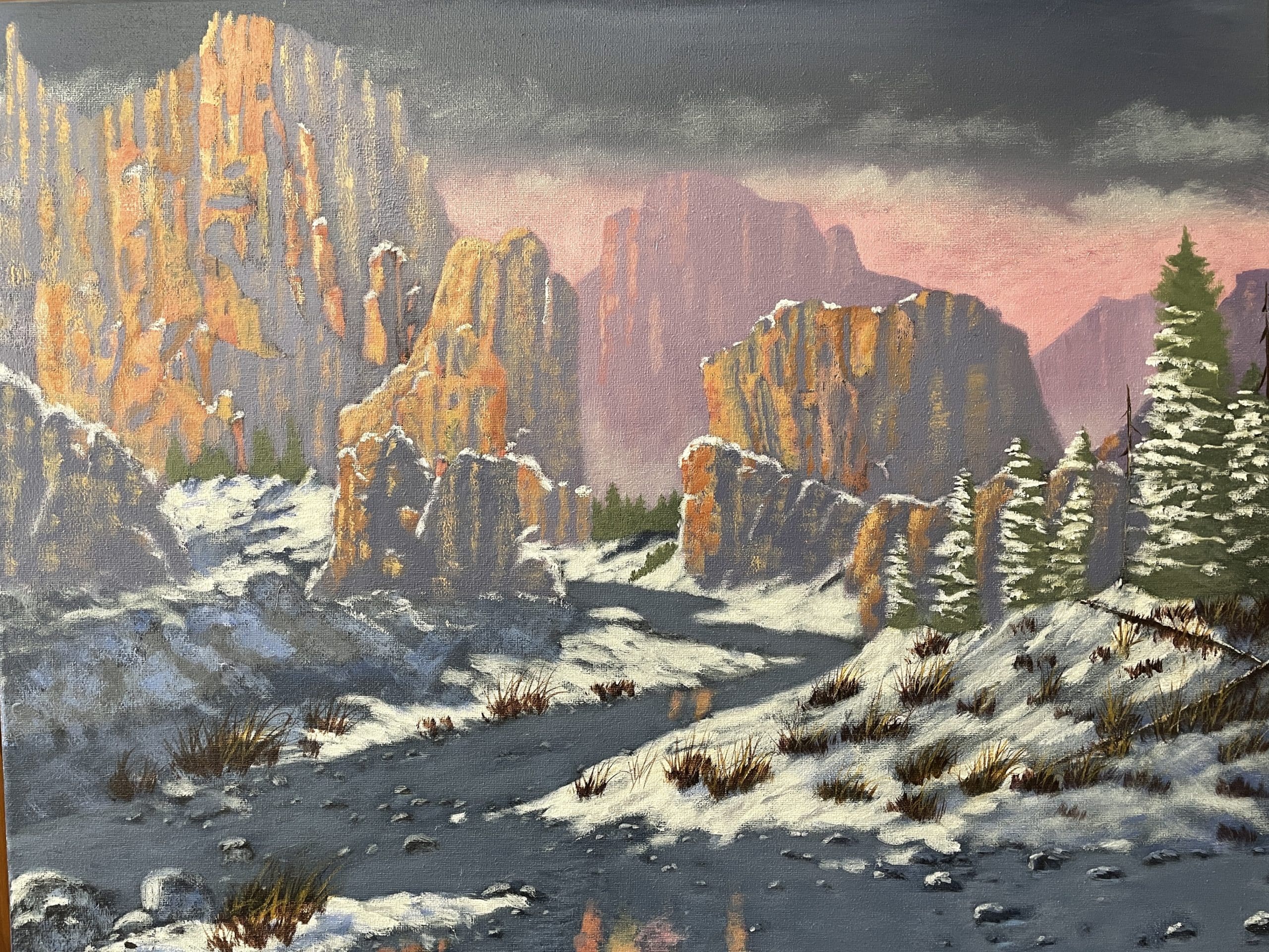
Hi, Ken-- Thanks for resubmitting this assignment. Sorry for the extreme delay but I ended up with a case of covid and was not expecting it to set me back so much. But I am back to work now and ready to help you get to the next assignment. First of all this painting has gone thru a lot of changes and each time it has improved. You finally got the highlights rich and bright to actually show the true tones of those canyons . As we discussed before your sky and background mountains are the perfect value. The only thing I want to mention is that your water is all one tone. It would be better for the water to be lighter in the background and gradually become darker as it comes forward. In fact the water can be very dark in the very foreground. The other thing I might mention is that even though the brighter tones you added to the canyons really did help the color scheme when you added the tones you painted too dry. The highlights are rough and scratchy. The next time you add brighter highlights to an object make the mixture a bit more creamy and use one of the dynasty chisel brushes. No need for you to re send this just make those minor corrections on your own and then you can move on to the next assignment. Donna will send you the criteria for that assignment real soon. Congratulations and God bless you and stay inspired.
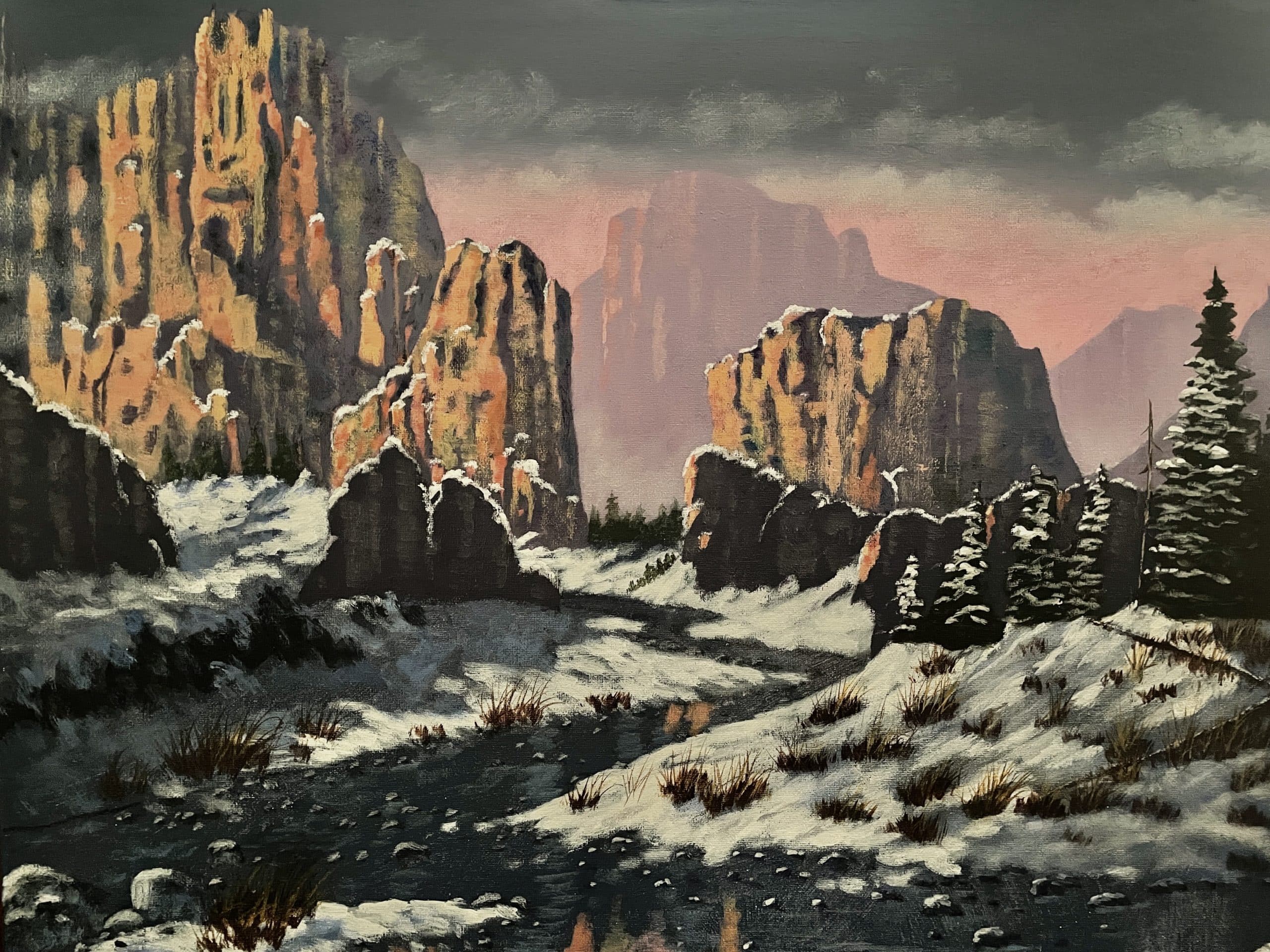
Hey, Ken, Thanks for resubmitting this assignment. It still seems we have a slight disconnect in my critique. Once again the over all structure of your painting is very good and the distant mountains and sky are great. The problem is in the overall color and contrast of the middle and foreground rock formations. The orange/goldish highlights are a lot better than what you had. So I think we can live with those. The real problem is the extreme dark black tones of the rocks, water and trees. Granted the water is dark but not as dark as you have it. This makes the painting way to stark and the edges of the rocks too sharp. ken since these are very advanced paintings we have to stick to the extreme technical issues. So what i want you to do is create another dark blackish mixture like the rocks are now. then add just enough white to change the value by about two values. Now take some small amounts with your 4 or 6 bristle brush and thin it down substantially with water . Now scrub this glaze over all the dark areas of the water, rocks and trees. This should soften all the dark areas. Then you can add some soft green tones to the trees to give them some life. Now try your best to soften the razor sharp edges on the two middle ground formation. Try these things and lets see what happens. dont give we will get there. God bless and stay inspired.
Dear Ken, thanks for submitting your assignment. After a careful study of your painting, I notice many technical issues that need to be discussed in detail -- too many when limited by this format.. So as I have done for several of my advance students, I'd like to arrange a call to discuss the main issues -- and then you can correct those and resubmit. Please send Donna your availability to do a phone call with me. You can email her at support@yarnellschool.com. Thank you and God Bless, Jerry
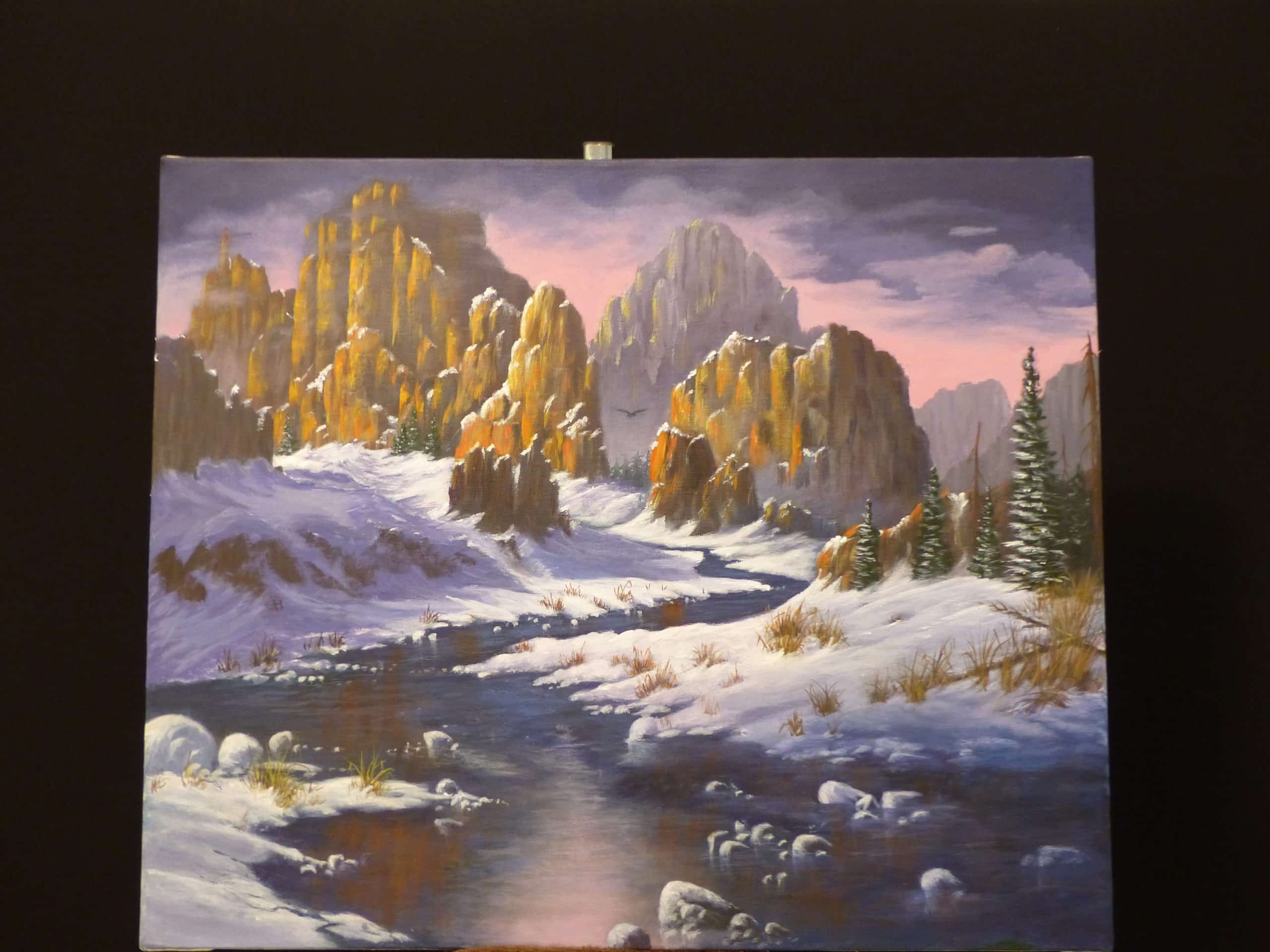
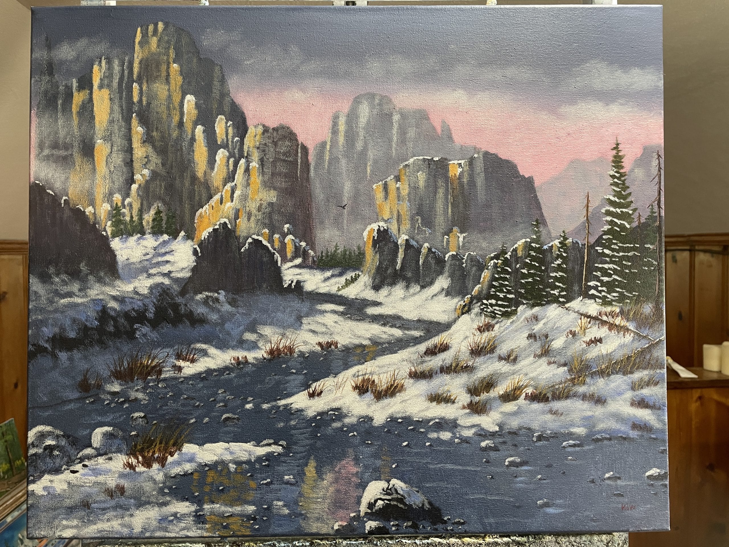
Hi, Gail, Thanks for resubmitting this assignment. These changes really did make a huge difference. You did a great job. The water looks much better after you removed all of the extra snow clumps. You have much better eye flow. The only thing I really want to discuss is the highlights on the large rock formations. No doubt you made them brighter and they really pop. The problem is you used the same yellowish gold highlights on all of them. It is ok to use those tones for sure but not as the dominant color/tone. Remember these are the red rock canyons and it would be wise to scatter some touches of cad. red light throughout the formations and even touches of bt. siena. This will help warm them up and give them the red tones they are known for. Now your background formations are the proper tone so that worked out ok . Gail there is no need to send this back. These are such minor adjustments I just trust that you can make these adjustments on your own and move on to the next assignment. So keep up the good work, God bless you and stay inspired. This painting deserves a good solid high grade score.
Hey, Gail, Thanks for submitting this assignment. You have now moved into a very different phase of fine art painting techniques. Each critique will be based only on technical merit. And there may be times you may not totally agree but I assure you my main goal is to push you to the limits of creating high quality professional work. Now the composition and main elements are painted well but the over all tonal elements are fairly flat and dull. This painting was designed to be very clean, crisp bright with the wow factor built. So starting with the sky the pink horizon is good but the dark area looks kind of muddy. It should be a little cooler with a touch more purple in the mix. I would use ult. blue, bt. siena and purple. Now the very distant mountain on the lower right is too warm/brownish. It should be cooler and more on the purple gray tones. The next big gray mountain to its left is too gray. it has no life. So create a more purplish gray tone for it as well. The value is ok just change the tone. Now the large formations in the middle and foreground are fairly well painted and the shadowed side of them are good. But the highlights dont pop. You may not be used to this but these final high lights need to be applied very thick, clean and even with some pure cad. orange, cad. reds cad. yellows. Just play around with some very bright tones and even use a palette knife to apply the final highlights. Your snow is in pretty good shape but the cast shadows from the rock formations are not rich enough. They need to be about two values deeper in order to help create the drama this painting requires. The little snow drift just to the left of the stream needs to be deeper in tone both the cast shadow and the dirt banks showing thru. The water is fine but the white snow drifts are to busy and all similar in shape. Granted there is suppose to be quite a few of these but yours over power the fore ground. So take some out make some flatter and and create more connection for better eye flow. The lower left snow is good and your pine trees are good. The grasses are ok just a little busy you could play with those a little bit to create better negative space/eye flow. I know this sounds like a lot of work but you have actually done well you just need to bring it to life. Good luck God bless you and stay inspired.