
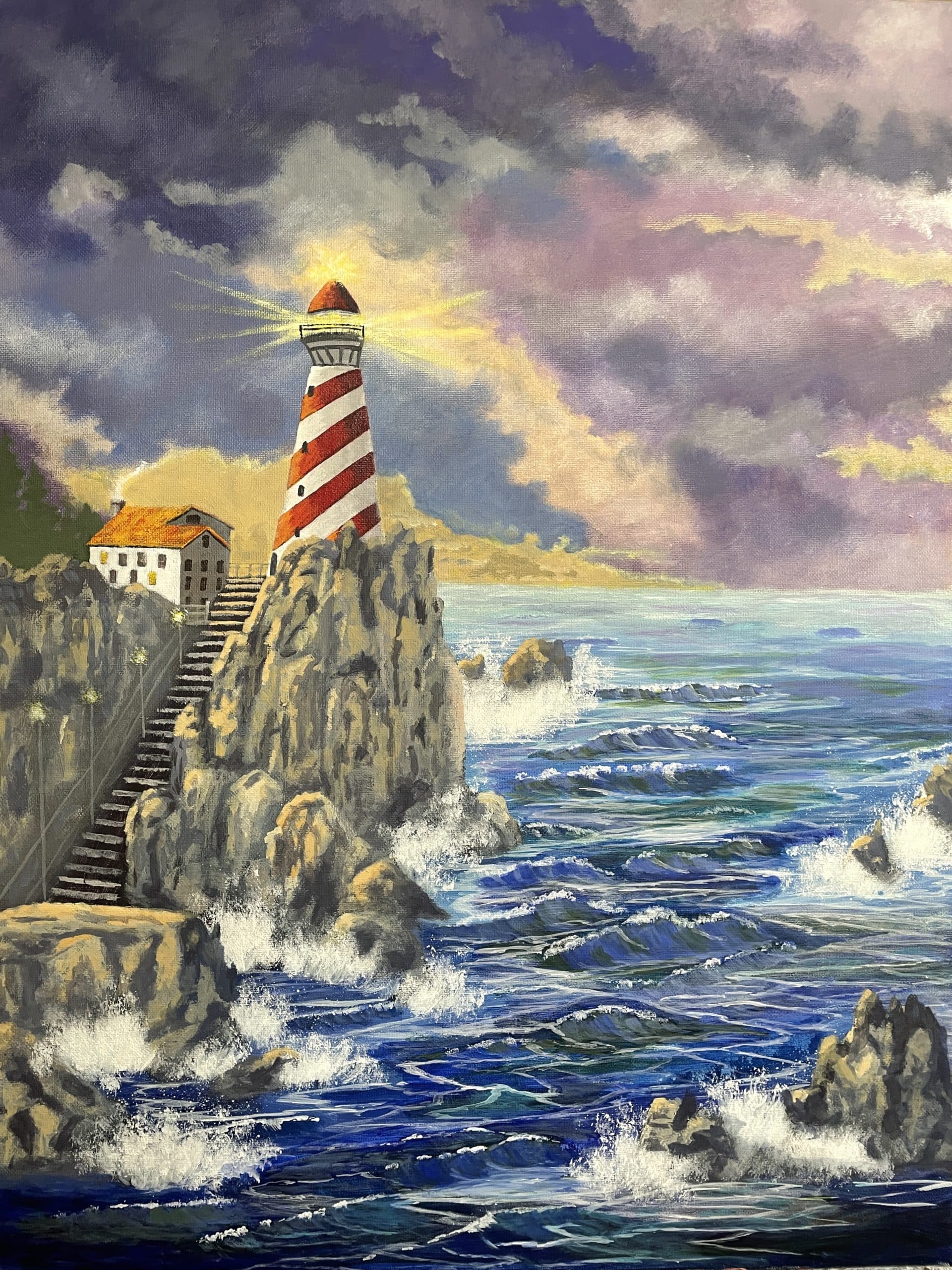
Painting Assignment # 2
Seascape
Late evening semi stormy sunset – with special emphasis on using a darker, richer value system and particular attention to the negative space rule to create good eye-flow and form in the waves, vertical rock formations, and stairway.
Season: N/A
Size – 18 x 24 Acrylic – Vertical Format
This is a beautiful seascape. Don’t let this painting fool you as it is loaded with all of the traditional technical elements of composition, design, perspective, values, color harmony and compliments. But hidden within all of these elements are the things that make it a very advanced, challenging painting.
I will be looking for proper wave action (movement), proper highlighting to connect each wave, subtle value and color changes within the waves, proper angle of the stripes on the light house and many other challenges.
So study it carefully and take your time to work out each issue.
Good luck, stay inspired and have fun!
Recommended instructional material from Yarnell School Online:
The instructional material we have on YSO will be a benefit for certain techniques – and by now you should have a feel for what snippets and paintings there can best enable you. We continue to advise you to take full advantage of those.
However, know that because the Category Landscape II is so advanced and because this is an extremely advanced painting, we do not have instructional material to match up to these assignments. To explain, once you reach this level, we assume that you already have gained and retained the knowledge, ability, and techniques at a level that will help propel you in getting through these painting assignments.
This will be a lot of fun, so grab your brushes and get started – I can’t wait to see what you come up with! Good luck.

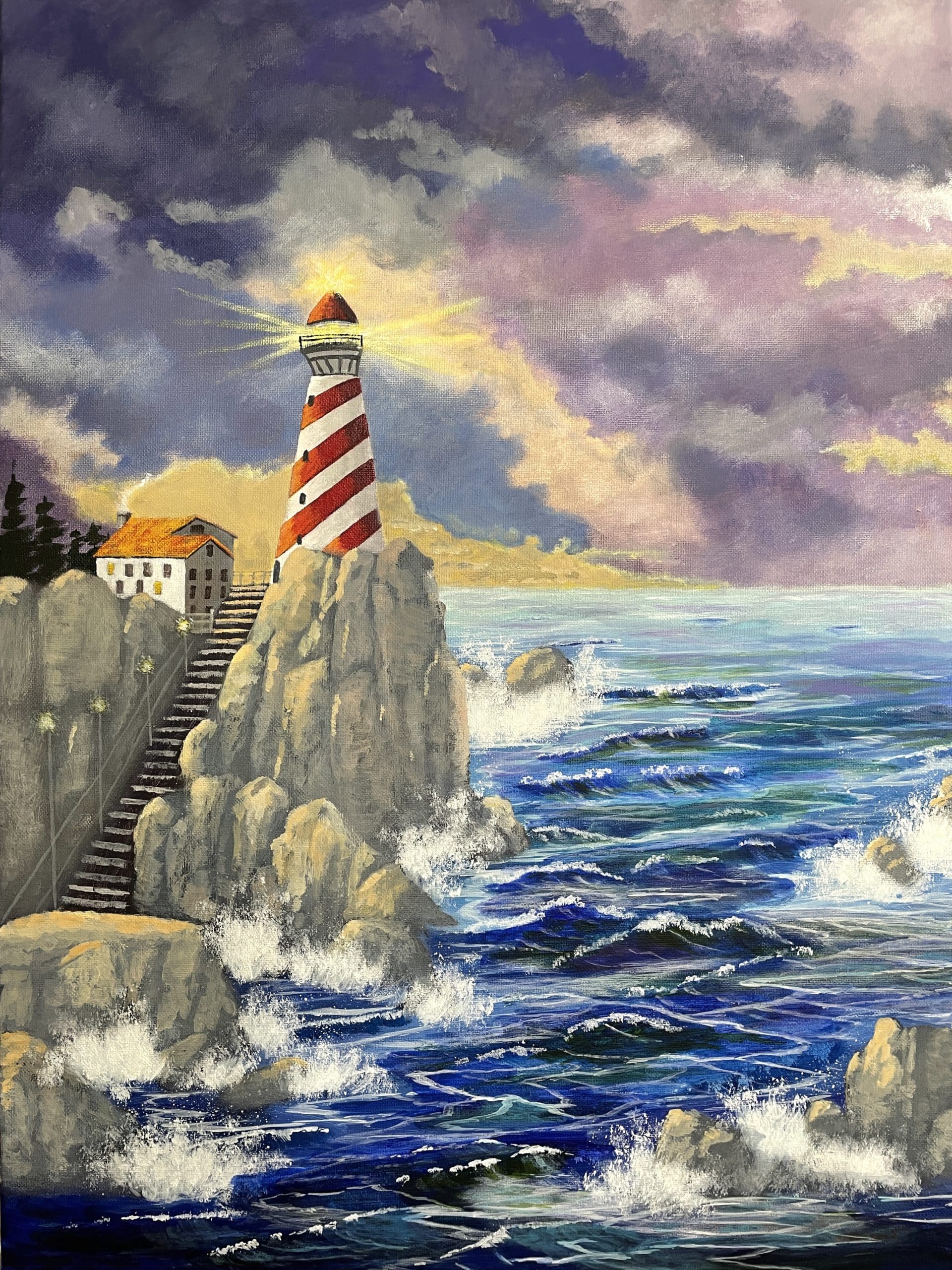
Hey, Ken, Thanks for resubmitting this assignment. Wow this time you got the rocks looking really good. Now they look more like rugged rocks. They are a little busy but you did such a good job I would much rather you leave them as they are and not mess with them. Also the waves are greatly improved and now the entire painting is in good shape. The main thing I want you to work on now is your blending technique. Your work is a little choppy and rough. It will take time but you need to really work on making more subtle transitions from color to color and value to value. Then your work wont look so choppy. Plus your work will appear more professional. I feel really confident that you are improving enough that you can move on to the next assignment. So congratulation. Cant wait to see how you are going to handle the next assignment. God bless you and stay inspired.
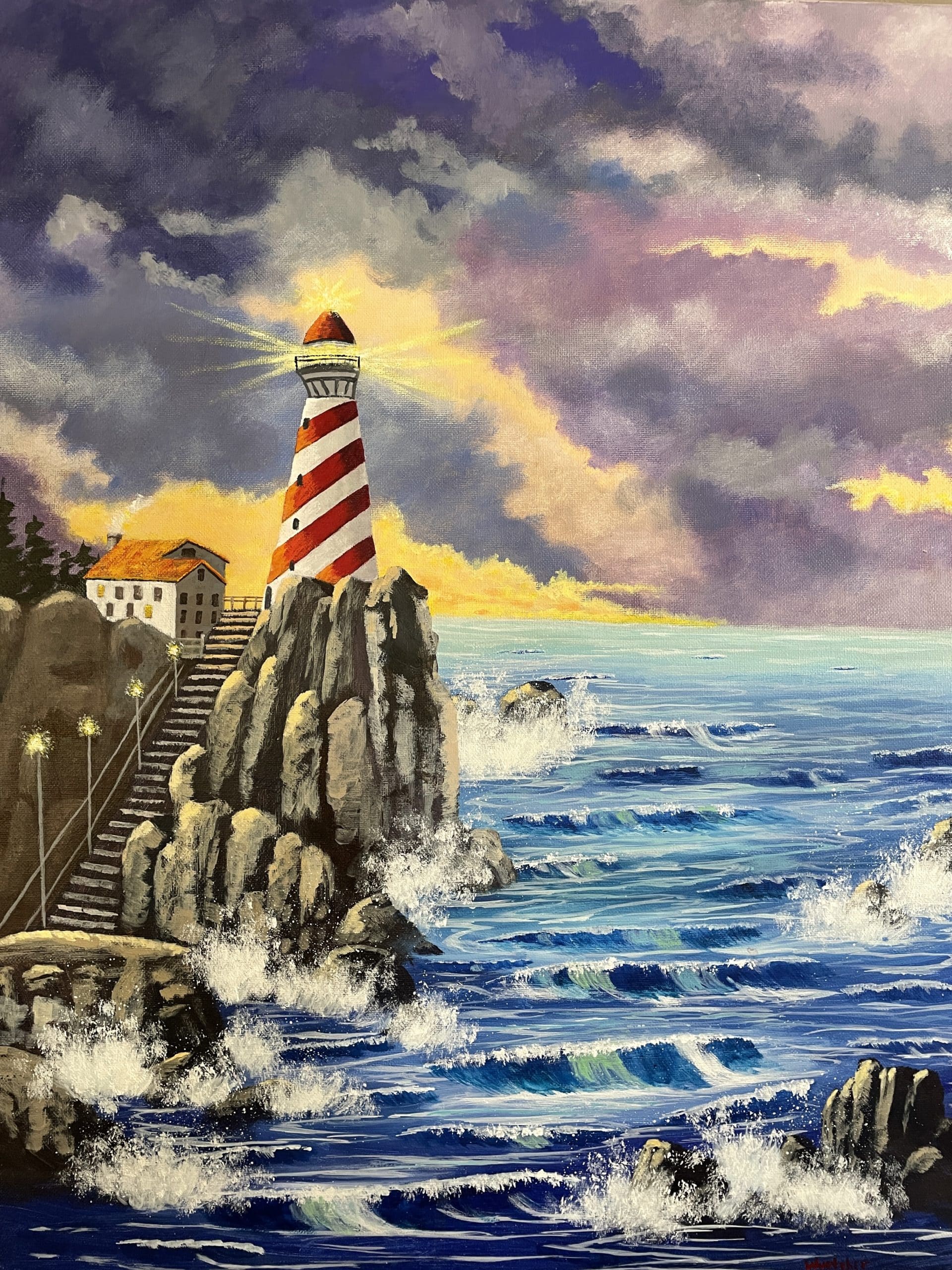
Hey Ken thanks for re submitting this assignment. There are three basic things that still need some work to bring this up to the standards we are shooting for. As i mentioned before in the last critique the basic structure of the painting is fine but you are still having a little struggle with the value system and the contrast rule. For example - and it may seem like a small thing but the dark green cedar trees next to the house are too dark. They catch your eye and hold you there too long. So you need to change there value and tone by about two values so they will be closer in value to the house. The same thing with the dark breaking waves. The dark areas are too dark so they over power the rest of the waves . So tone those down also by about two values. However the biggest issue are the rock formations. First of all they all seem to have the same tones and rounded shapes on the tops of each group. The values are too light and mono cromatic. So the first thing is to add some darker values of various shades of grays by at lest two values to bring them forward. The very front boulders should be the darkest parts of the painting. So make them at least 3-4 values darker. This is important because they anchor the corners of the painting and serve as eye stoppers. Finally because these boulders have been exposed to the elements for hundreds of years they need too be more rugged with more distinct edges instead of so rounded. Its ok to have some rounded edges but not too many. I know this seems like a lot of work but these are such advanced paintings it is important that we not leave any stone unturned. Keep up the good work and God bless you and stay inspired.
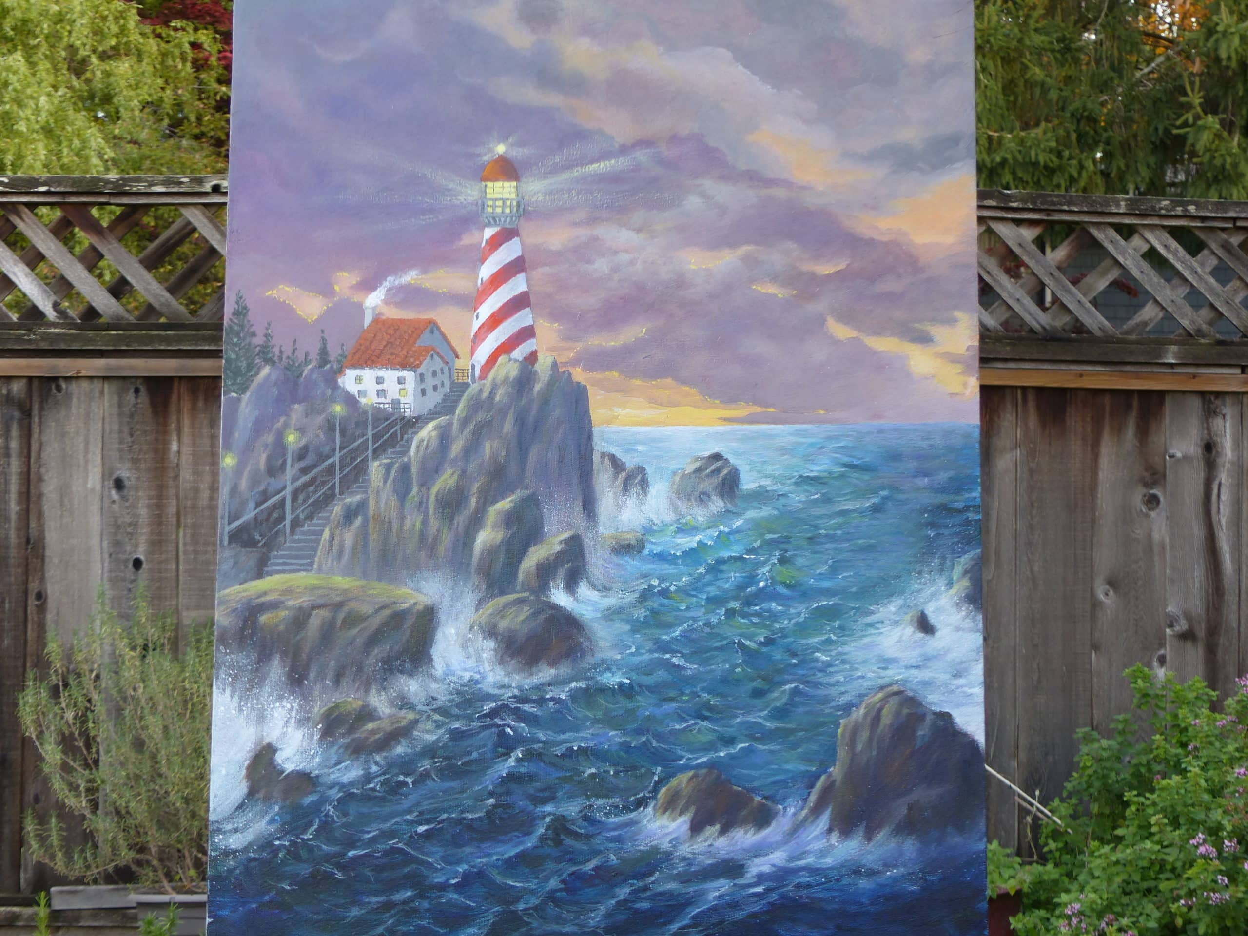
Hey ken thanks for submitting this assignment. Starting with the sky. You did a good job painting the sky however all of the colors are too strong . The yellow needs to be toned down. it competes with the foreground and throws the value system. so tone it down by about two values. Now the light house turned out really well as well as the steps, house and other objects in that area. Another issue is the rock formations. They are too dark and too rounded. Rock formations that have been beat down and eroded in the wind, and waves crashing against them usually are much more rugged and rough looking. These all have the same basic rounded shape. So you need to work on changing there shapes, sizes and the color by putting some gray tones mixed in the darker areas.[everyone struggles with these kind of rocks so dont get discouraged ] Now your water is way too blue. Its ok to have some of the blues but you need to add some of the other colors that are in the painting to create color harmony like some soft purples, grays, a little turquoise and soft greens. Also it would be a good idea to change the shape of some of the waves. Right now they all are too much the same shape. So move them around to create more overlap and better eye flow. Ken I know this seems like a lot of work but it will be worth it. These are very advanced paintings and require advance techniques and applications. So good luck and i cant wait to see the corrections. God bless you and stay inspired.

Congrats! You did the suggestion and a nice job making the lighthouse 3-dimentional. Now on to next assignment. God Bless you and stay inspired!
Hey Gail Thanks For resubmitting this assignment . Taking the photo outdoors in the shade really did help make the tonal values appear more natural. This is a great trick so use it as often as you are able. Now as we discussed before the painting turned out very well. The rocks, water, waves, and sky are well done. The only issue is the dimensional form of the light house. It may seem like I am being very picky. It just needs better form. The red stripes are fine because you have a gradual dark to light blend. But now you can work on the white stripes. All you have to do is darken the right side of the stripes by about two or three values with a soft cool gray tone then gradually blend across to the left side. This will make the light house appear to be much more rounded. Then you will be done and you can move on to the next assignment. So God bless you and stay inspired.