Season – Mid to Late Summer
Size – 18 x 24 Acrylic – Horizontal Format
Three to four layers of rolling hills (not mountains), dirt road or pathway entering painting, large dead tree with lots of limbs, multiple leafy trees, and some water feature (stream, river, lake, pond), semi- stormy sky with multiple-toned cloud formations. Finally, a good strong light source to create atmosphere.
Starting now we are going to change things up a bit! Unlike the previous 5 Assignments wherein you were provided a reference image, in this assignment I will provide the subjects, season, color scheme, time of day, and you will be challenged to arrange each of these components into a well-balanced composition with good eye flow, proper color balance, value changes, and of course how well you depict the season, subjects, and atmosphere.
So study it carefully and take your time to work out each issue.
Good luck, stay inspired and have fun!

Recommended instructional material from Yarnell School Online:
The instructional material we have on YSO will be a benefit for certain techniques – and by now you should have a feel for what snippets and paintings there can best enable you. We continue to advise you to take full advantage of those.
However, know that because the Category Landscape II is so advanced and because this is an extremely advanced painting, we do not have instructional material to match up to these assignments. To explain, once you reach this level, we assume that you already have gained and retained the knowledge, ability, and techniques at a level that will help propel you in getting through these painting assignments.
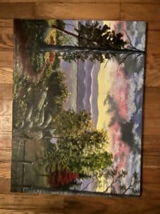
Hello, Ken--Thanks for submitting this assignment. Also please accept my apology for the long delay. I had an un expected medical issue and ended up in the hospital for a few days and then a long recovery. But I am now back to work and trying to get caught up. I really do like this painting. You did a good job on your rocks. The trees are great because of the highlighting on them. they are now seperated from each other instead of a large mass. The overall composition is great. The pathway was a good idea to draw you into the center of the composition. Even the fence was a great way to pull your eye into the center of the painting. All of these elements of the painting are well done. The only real issue is the dark cloud. It is too dark and overwhelms the color scheme. So you need to tone it down by about two values so that it dose not compete with the over all color scheme. Also the mountain range is still too dark to be that far in the distance. so all you have to do is put a soft light gray wash on them to tone them down by about two values. This will help create more depth. Over all Ken you did a great job. so if you will take care of these minor issues there wont be any need to resubmit. This painting will pass with flyiny colors. It has been a real joy working with you on this painting. God bless you and stay inspired and keep working on blending techniques and value changes.
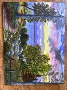
Hey, Ken, thanks for submitting this assignment. Sorry for the delay. We have been in the process of moving and i am behind on everything. Any way I really like the composition. However you do have several technical things to deal with. I like your sky very much. The value system of the distant mountains is good but is too blue. They need to be grayer and softer. Also the water is too blue. It is a general rule that you reflect some of the sky tones in the water. So carefully and very softly drybrush in a few sky tones. Now the three dark green bushes right in the center painting are too rounded so break them up and use the negative space rule to make them more interesting. The rocks have the same problem. They are all too rounded. So change their shapes up a little bit. Now the trees on the right are good except they all run together. I suggest you seperate them a little bit by simply adding some brighter highlights on the top right side. This will help to seperate them. The dead tree path way and fence look really good.The grasses and flowers look good. It would be nice to make the little reddish tree on the right side about two values brighter to help give the painting a little more tonal balance.. I know this seems like a lot of work but really these are all fairly simple corrections to make. Cant wait to see the changes. God bless you.
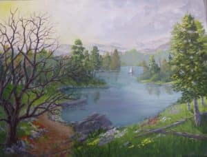
Gail, Thanks so much for re submitting this assignment. Sorry for the delay but we have been extremely busy and am behind on everything but finally getting caught up. The good news is you have finally got this painting in really good shape. The composition, value system, color scheme and the negative space issues all work together to create good harmony. There is only one area left that you need to correct. The reflections in the water that you added from the trees on the little island on the right side of the lake are all leaning the wrong direction. You have them leaning to the right they should lean slightly to the left. The technical rule is " All reflections lean the same direction in the water as the objects being reflected " For example if a fence post or any other object leans to the left the reflection will also lean to the left just as if an object lean's to the right the reflection will also lean to the right. It is a very common mistake for students to assume that reflections lean the opposite direction. I recommend you study one of my books on composition or the snippet on shadows and reflections. This is a very simple thing for you to correct and perhaps it seems as though I am going over board with this but is a valuable lesson for you to learn from and will keep you out of trouble in future paintings. Any way no since in re submiting this assignment. I will just trust you to make this simple correction and you will be on your way. So congratulations this painting is finally going to pass and deservers a good high score.. Donna will be in touch with u in a few days to get any biographical information you want us to use on our web site to promote you . We also will be sending you a beautiful engraved plaque showing your accomplishment. God bless you stay inspired and keep painting.
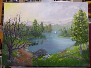
Hey Gail thanks for re submitting this assignment. Please accept my apology for the delay in getting back to you. I had a minor medical issue and had to spend a little time in the hospital. And then a few days of recovery. But I am back at it full time now and trying to get caught up on all of my assignments and commission paintings. You are at the top of the list. After a careful review of your painting. There are only a few minor adjustments you need to make and then I think you will be done. First of all the adjustments you made after the last critique worked out very well. The water looks better and leaf canopy on the trees really helped the negative space issues. The main thing you need to fix is the little boat dock. You painted it dark brown which is the wrong color and the value is too dark. Therefore it has a tendency to stick out like a sore thumb. All you have to do is paint it more of a charcoal grey and lighten the value so that it fits into that area of the painting . (the dark brown tone against the lighter water is too contrasting which is why it stands out too much.) Now on the little island on the right side of the lake you forgot to put the reflections of the trees in the water. Just paint them in like you did on the trees on the left side. ( nice and soft) Also the reflection of the boat dock should come down straight below it and make it a bit longer. The way you have it painted is more like a shadow instead of a reflection. It is easy to get reflections and shadows mixed up with the water. So just remember reflections go directly below the object and shadows will be at an angle depending on where the sun is. I recommend you study reflections/shadows in my snippet series. As well as study other artists paintings that have water in them. I dont recommend you mess with the large dead tree any more or it will become over worked. Just keep practicing with the script brush to achieve nice gradually tapered limbs. Your tree just needs to have better form with each limb from thick to the gradually thinner tapered finish with proper proportions that support other limbs attached to it. Any way these minor things should be easy for you to do. And then you can move on. So God bless you stay inspired and keep painting.
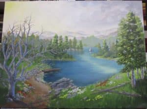
Hi, Gail thanks for submitting this painting. The overall affect and composition are good but you do have some technical issues with the color scheme,value system and some negative space issues. first your water is way too blue. You can have some blue in the water but also need to pick up some of the softer lighter tones like the sky. Other wise the water overwhelms the painting. Also the row of trees on the left side are all lined up in a row, with the same basic shape and the same space between them . So you need to rearange them so they have more interesting negative space in and around. So let them overlap each other and and maybe one a little taller and perhaps maone a little fatter. These kind of things catch your eye like the blue water dose. Now your value system is good until you move into the foreground.The rocks are painted well but they are not dark enough. They are the same value as the background trees. So make them about two values darker. Also the large dead tree on the left side is too light as well. So make it about two values darker. It is very important to keep your value system in the right order. The rest of the painting is in good shape. You just need to get everything technically correct so that your painting will look more professional. Good luck with making these adjustments. God bless you and stay inspired.