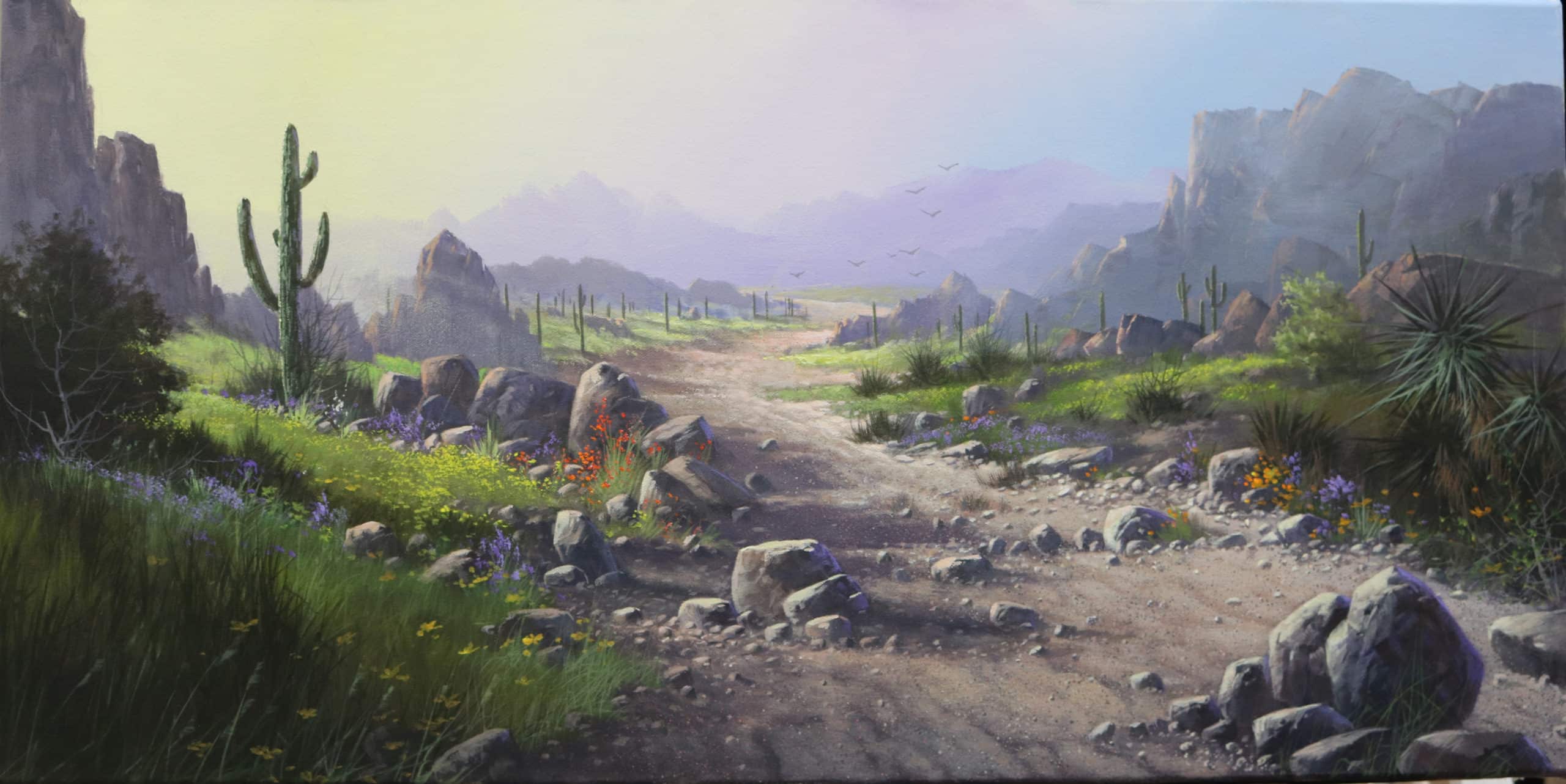
Season – Early Spring
Size – 15X30 HORIZONTAL ON MEDIUM DUCT COTTON CANVAS (ACRYLIC)
Don’t let this painting fool you. It will challenge every part of your technical knowledge. I will specifically be looking for the proper gradation of the very soft values that create the distance and hazy atmosphere of early morning. I will be looking for soft edges, proper balance of negative space, and proportions of all of the rock formations and other objects. I will be looking for proper color harmony, compliments, and good balance of warm and cool tones. Finally I will be looking for good blending techniques. NOTE: Be sure you have at least 7 value changes to create the proper distance in this painting!
Good luck, and God Bless You!

Recommended instructional material from Yarnell School Online:
The instructional material we have on YSO will be a benefit for certain techniques – and by now you should have a feel for what snippets and paintings there can best enable you. We continue to advise you to take full advantage of those.
However, know that because the Category Landscape II is so advanced and because this is an extremely advanced painting, we do not have instructional material to match up to these assignments. To explain, once you reach this level, we assume that you already have gained and retained the knowledge, ability, and techniques at a level that will help propel you in getting through these painting assignments.
Hey Ken Thanks for re-submitting this assignment. It looks like you did a great job making the suggested changes. However there are a few odds and ends I would like to bring to your attention. These are things you can do on your own without having to re submitt. Over all this is a very good painting. One of your better ones. Your value system is allmost perfect.The color scheme and composition is great also. You are definately improving.You are still painting a little bit too stiff with hard edges on certain objects like the large bolder in the lower right and the large cactus. Its hard to explain but you need to slightly soften the edges so that they dont look like they are stamped on Ken any time you have large dark objects in a painting like this they need to have the softer edges but they also need to have the standard bluish purple highlight on the shadowed side of the object. This will also help soften there appearance. The only other thing is the two boulders to the right of the large cactus look like two tin cans. So just give them a little more interesting shape and they will be ok. Congratulations good job. I cant wait to see how you handle your next assignment.God bless you and stay inspired.

Hello, Ken-- Thanks for resubmitting this assignment. The suggested changes you made Really did help the painting to be more technically correct. As I mentioned before Your value system, color scheme and composition are good. The rocks and boulders are well placed and their color and value turned out really good. However they are a bit to rounded and smooth to be desert rocks. So you need to make them more rugged/jagged and not so smooth. So Ken the main thing I would like to help you with is your blending techniques. If you notice for example the dark bush on the left of the large cactus looks cut out and pasted on. You need to use a #4or6 bristle brush and scrub the edges of the bush, grass and any other objects that have a strong contrast of dark against light or light against dark like the large cactus, the dark side of the large boulder in the lower right corner and the shadows of the boulders cast on the sandy wash. If we can get you to soften your edges on certain objects and paint with more impressionistic and looser strokes your work will improve instantly. So Spend a little a more time on these basic things and I will take another look and then you should be finished. Thanks for all your effort. God bless you and stay inspired.
Hey Ken thanks for sending this assignment. Just as I sat down to grade your painting Donna walked in my studio and said wow that is really beautiful and colorful. She is right you did a great job with your color scheme and your value system. Very clean crisp and clear. But as you might guess there is always a however. Ken you have always done well with your basic color schemes and values. The problem you keep having is with your blending technique. For example the large gray rock formations on the right side with the pink highlights dont really have any three dimensional form. The highlights are very stark,outlined and edgy.They look like they have been stamped on there and not blended.So you need to go back and gently soften the edges of the highlights so they will look more natural.It usually takes two or three layers of more of a dry brush application to achieve the proper affect.It would be a good idea to watch some of my dvds that have large boulders in them to see how i do the blending.The same thing goes for the rocks in the lower right hand corner.You need softer edges on the highlights. Most of your rocks have the same issue. The same thing applies to the dark green bush on the right side with the yellow green highlights.Just like the rocks the highlights look stamped on instead of blended. All of the background mountains,sky and cactus are fine.You just got into trouble when you got into the middle and forground and these are the same issues you had in the last painting.So really Ken if you can just really work on your blending techniques your paintings will greatly improve. Its a battle but one you have to win if you want your work to look more professional and be technically correct. Other than those things your painting is very well done. So see what you can do with your blending technique and I will take another look. God bless you and stay inspired.
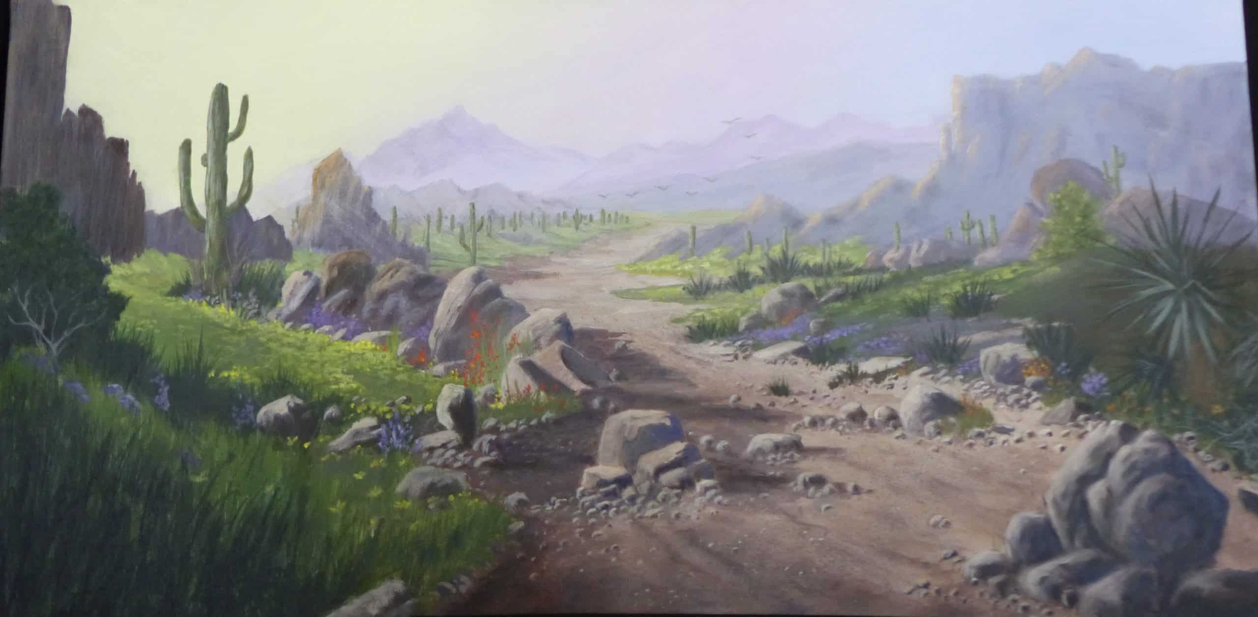
Hey Gail, thanks for re submitting this assignment. you have done a great job correcting the minor things that I suggested. Everything is working well. Your value system and color tones are well balanced how ever there is one area that is not working. Its no big deal but dose need to be corrected to balance out your color scheme. plus it will make your painting look more professional. Take a look at the pointed rock just behind and to the right of the large cactus. When you highlighted you made the cap way to brown so it sticks out. I recommend you gray out that brown tone. Then cool it off with a touch of white and a touch of orange and enough blue to cool it. Now do the same thing to the rock just directly to the right. Both of those boulders are just a bit too brown to fall in line with the color scheme. Gail this is an easy fix so don't worry about re-submitting it. Ill just trust you to take care of it then you can move on to the next assignment. You did a great job so keep up the good work God bless you and stay inspired. l
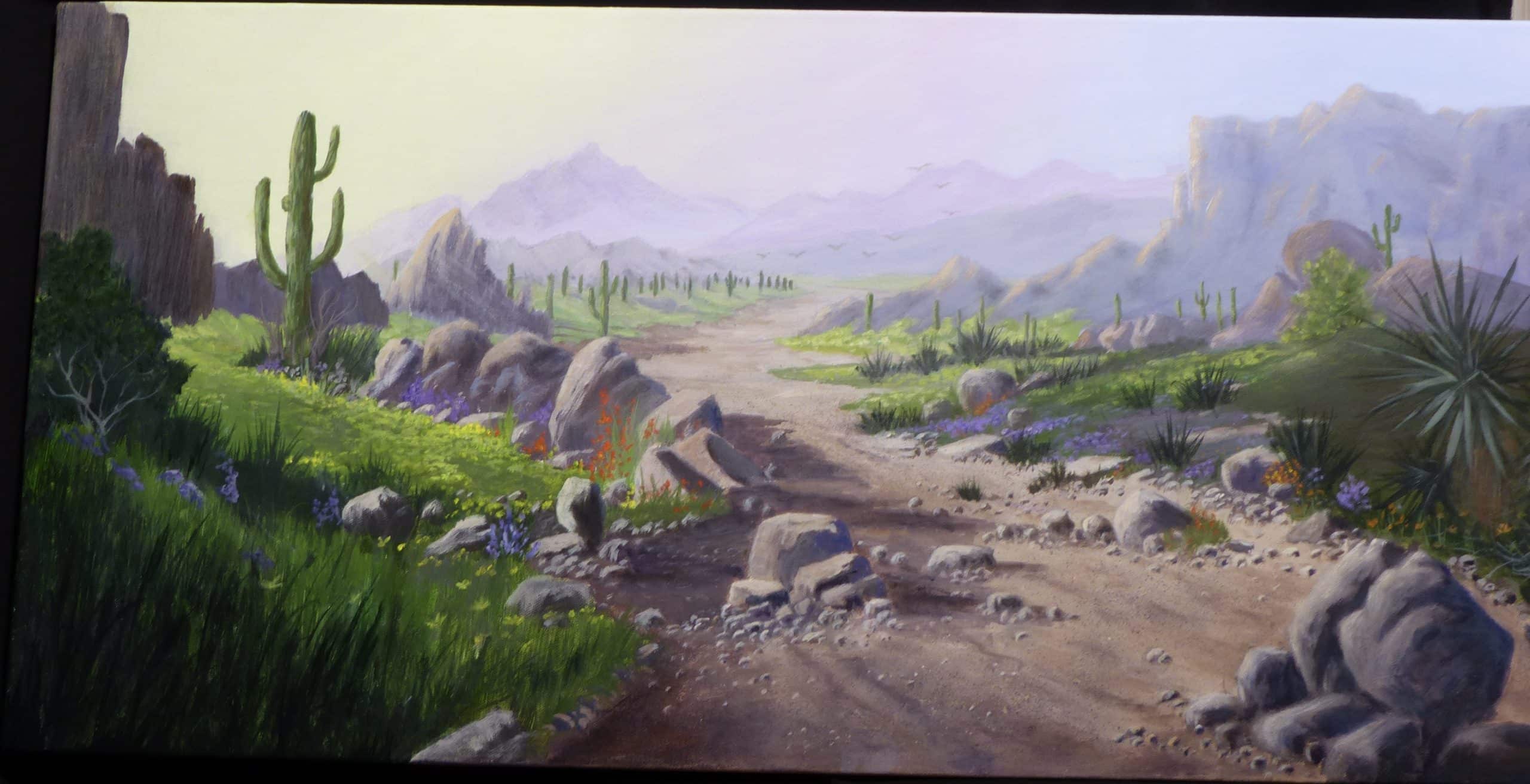
Hay Gail, Thanks for submitting this assignment. I really do like this painting very much. you did a great job on blending. The painting is very soft and clean. you really only have some minor problems that need adjusting. The sky and first layers of distant mountains are great . You got the values and tonal values right on. One problem you have is the small cactus scattered throughout the back ground are too green. In fact all of your cactus are too green. They need to be more of a natural deeper olive green. The mix I finally discovered that works best is purple, hookers green, with a touch of orange and sometimes a little burnt sienna. Then of course add what ever amount of white to change the value for that area of the painting. You did a great job on the dry wash/river bed. Your grasses, bushes, weeds and other ground cover is really nice. The main problem you really have is your rocks. These rocks and boulders should be more rugged and chunky. Your rocks are too rounded. You can have some like that but all of your boulders are rounded off too much on the top edges. So you need to make more rugged edges and unique shapes. Dont misunderstand you have done a good job you just need to create more ruggedness to some but not all of the rocks/ boulders. I cant wait to see the changes just be careful not to over do the corrections. God bless you, stay inspired .