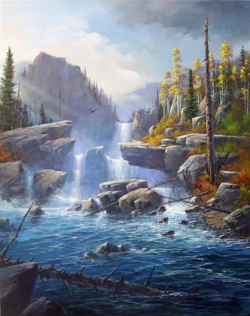
Season – Beginning of Autumn
Size – 20 x 24 Acrylic – Vertical Format
This is a magnificent study of moving water with multiple waterfalls, large boulders, and cliff-type rock formations. The setting is in the Pacific Northwest at the beginning of the Autumn…. just as Summer is fading away….thus giving you the opportunity to use a full complimentary color scheme. This painting will challenge every artistic bone in your body.
I will be looking for proper brush strokes with the water movement and the proper transition of colors from one value to the next.
So study it carefully and take your time to work out each issue.
Good luck, stay inspired and have fun!

Recommended instructional material from Yarnell School Online:
The instructional material we have on YSO will be a benefit for certain techniques – and by now you should have a feel for what snippets and paintings there can best enable you. We continue to advise you to take full advantage of those.
However, know that because the Category Landscape II is so advanced and because this is an extremely advanced painting, we do not have instructional material to match up to these assignments. To explain, once you reach this level, we assume that you already have gained and retained the knowledge, ability, and techniques at a level that will help propel you in getting through these painting assignments.
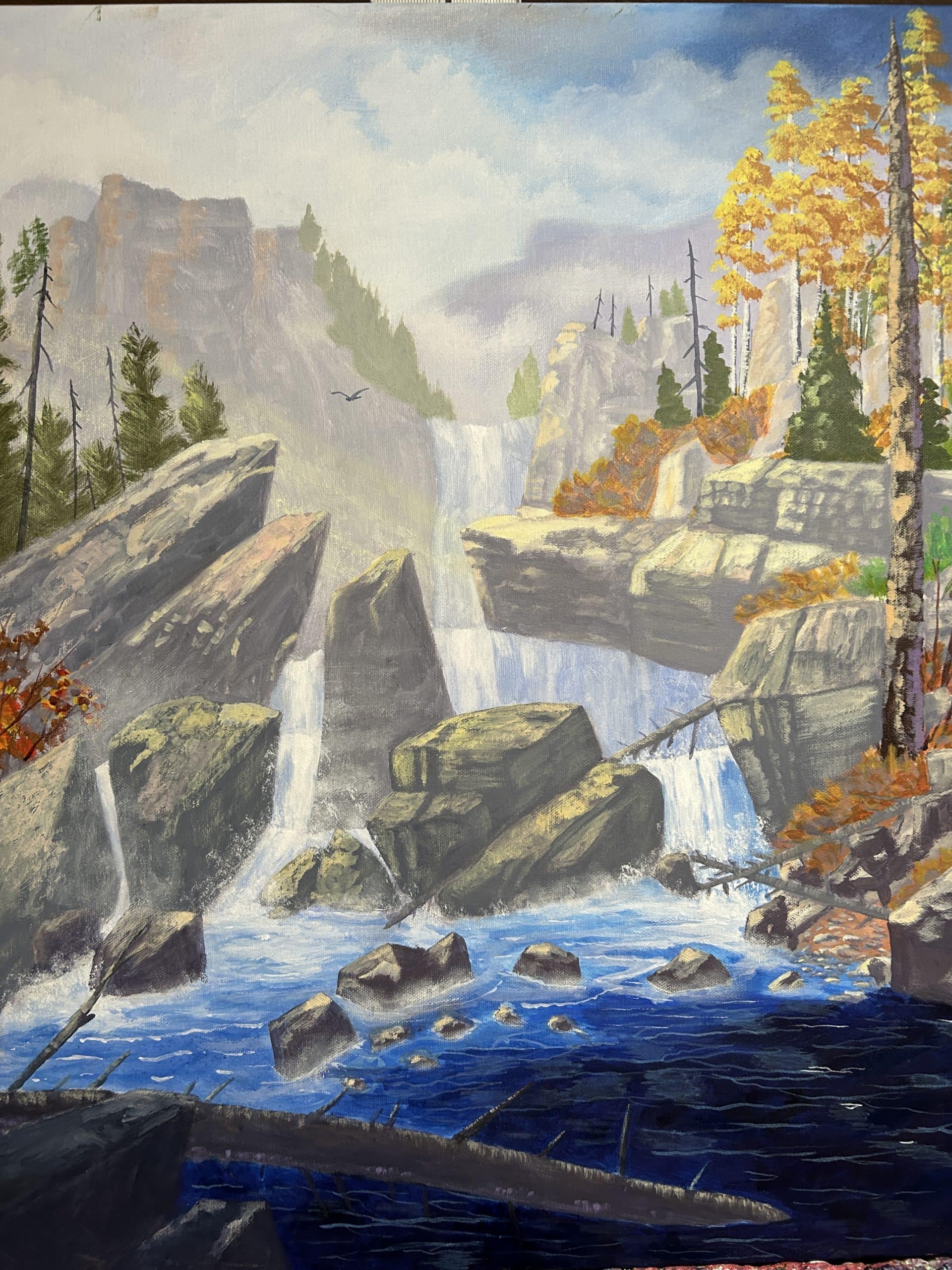
Hey Ken thank you so much for getting this assignment done so quickly. Well those two minor changes did the trick . Now everything is technically correct and in balance. I hope you can see the difference. Now your boulders don't appear to be floating and the distance pine trees don't stick out so much. You got the values just right. Now you will be able to move on to the next assignment.

Hey Ken Thank you so much for submitting this assignment. I owe you an apology for the long delay in grading this painting . So I ask that you forgive me. Im not quiet sure what happened. Everything has been so hectic and busy that some where along the way this assignment got lost in the line up. Any way I will make it up to you somewhere along the way. You have definately made significant progress in all of the areas we have discussed in the last few submissions. As I mentioned before these are very advanced paintings and I dont want to leave any stone unturned. So I have to be much more picky than with the paintings in phase 1. Your boulders, trees, value system, sky and water fall is in good shape. There are only two minor areas left that I want to bring to your attention. First the distant pine trees on the right side are still way too dark. They are on the same plane as the ones on the left side of the first falls. You painted them well put you just made them too dark. So they need to be lighter by at least two values. Similar to the value of the ones on the left side. That is an easy fix. The second thing is the boulders at the base of the falls still appear as though they are floating. The reason for that is because you have put a straight line across the base of them instead of splashing some water up against them. So splash a little water up against them to seat them and you will be in good shape. This is another easy fix and after you correct this then you can move on. When you submit these corrections I promise to put you at the head of the line and I will grade it ASAP. Then you can move on to the next assignment. Thanks again for your patience and understanding. God bless you stay inspired and keep painting.

Hey Ken thanks for re submitting this assignment. Sorry for the delay but have been extremely busy but finally back on track and trying to get caught up. You have made some great progress on this painting. But there are still some things you need to work out. Nothing major but at this advanced level of painting we dont want to leave any stone unturned . As I mentioned before your background values in the sky, mountains and trees are good. are good . The issue is with the bright orange bushes imbedded in the boulders on the right side. They over whelm the painting a little too much. They need to be painted similar to the leaves on the aspen trees. With a darker underpainting and more just touches of the orange highlights. They are too solid. So break them up a little instead of just a solid mass. I guess you could say they need a little more air/pockets of negative space. The Middle and foreground boulders are pretty good. Just keep practicing your brush strokes to create more rugged edges and not so rounded. Just for the record every one struggles with these. So dont worry you will improve as time passes. Now your water is good except in the foreground darker. Your water appears to angle too much to the left. So flatten out the highlights so they are more level. This will make your water appear flatter and more level. Dont misunderstand you dont want to loose the movement of the water you just want to level the water . finally your fallen log in the foreground still looks like a square log instead of rounded. This is easy to fix . Just blend the highlight into the shadow area to get rid of the hard line. So make these changes and you should be in good shape. God bless you and stay inspired.
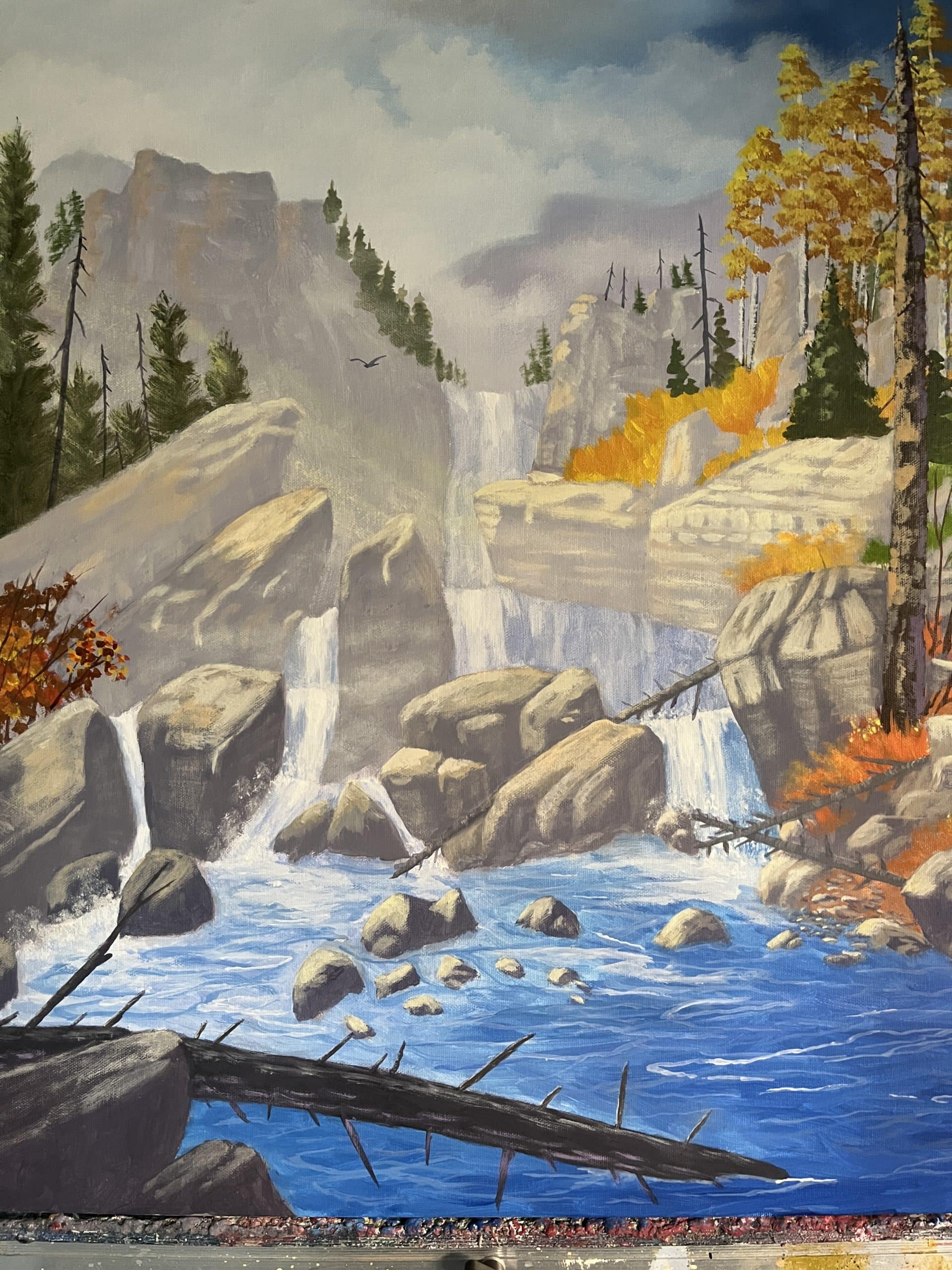
Hello, Ken, Thanks for submission of this painting. You are making progress. I have spent a lot of time studying your painting to figure out the best way to explain some of the problems you are having. You have improved your value system to some degree but you still have some gradation issues which simply means going from one value to the next. All value changes should be very gradual and carefully blended. For example the sky, and first two layers of rock formations very good but the first group of pine trees are still too dark in relation to where they are located. They need to be the same value of the rock formations they are sitting on. So simply take the pine tree green you used and add some of the rock tone to lighten and gray them. Right now they still stick out too much to be that far back. The first water fall is fine and the rock formations on the left side are ok but the rock formation on the right that sticks out over the falls is too pale and washed out it needs to be about two values darker similar to the vertical rock just to the left that stands up fairly straight. The rest of the rocks are ok . Now the water is still too blue. The blue needs to be in there but needs to be more compatible to the rest of the color scheme. It needs to be a deeper grayer blue similar to the tones in the upper right corner of the sky. Gradually make the water darker with the deeper tones as you come forward. The dead log is ok but needs more highlight on the top to make it appear more rounded. See how you do with these changes and maybe that will finish it up. Dont give up this painting gives every one trouble . I just dont want to leave any stone un turned. God bless you and stay inspired.
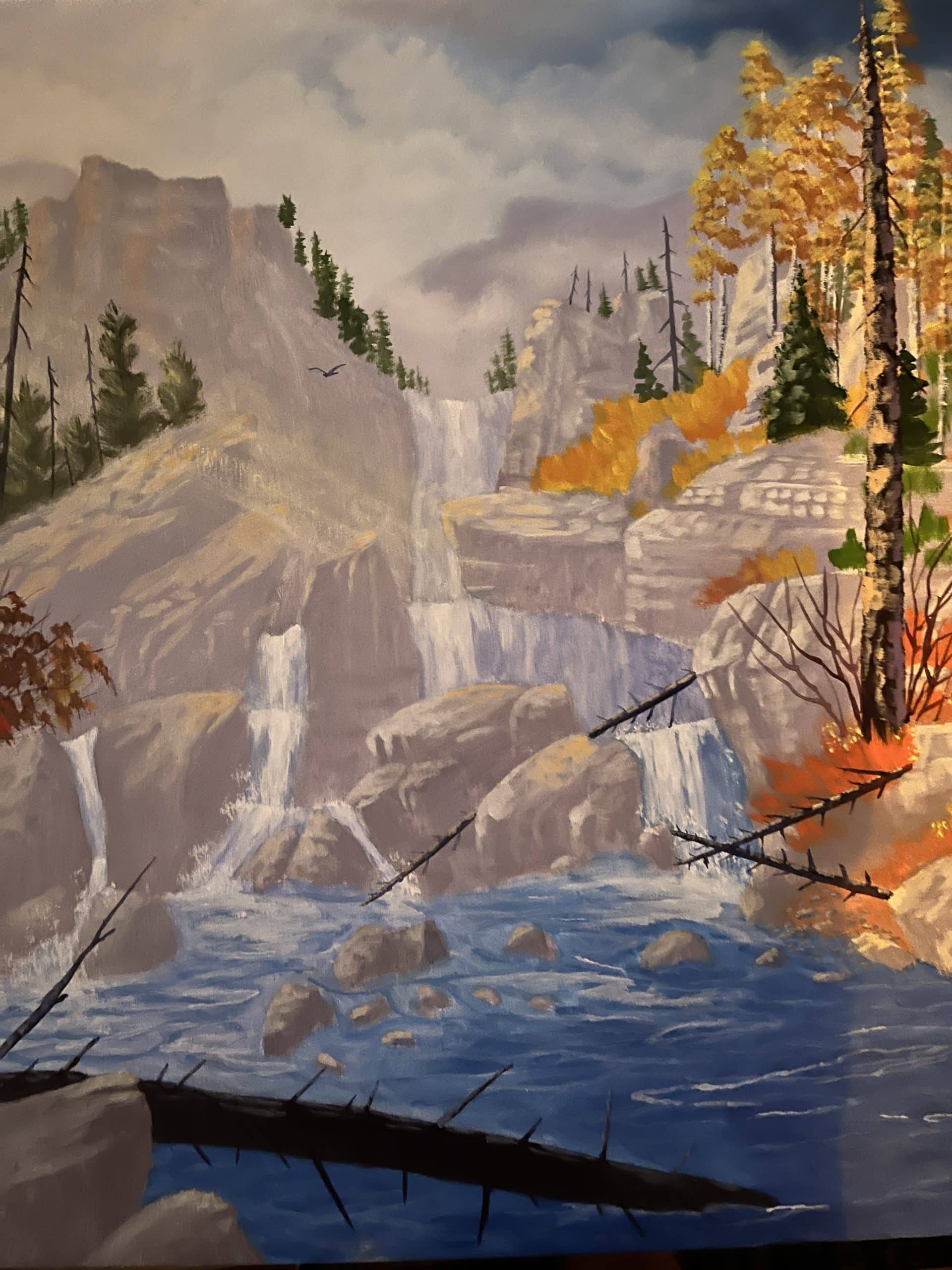
Hey Ken thanks for submitting this assignment. Your sky turned out very good and the falls are good to. The problem you have is with your value system on the rock formations and on the row of pine trees just to the left of the first waterfall. They are too dark they need to be the same value of the rock formations they are sitting on. then from that point forward all of your rock formations are too light they need to get darker in value, richer in tone, and much more contrast. Right now they look very pale and flat and washed out. I see you tried to make an effort to get some very minor value changes but not near enough to give them that bold rugged look they need to have. Also use different shades of grays to help create more seperation between formations. Also the fallen logs in the middle of the painting are too dark. They stick out too much. Ken there are a few more things I want to discuss with you when you re submit these changes but I want to see how well you manage the value system on the things we discussed in this critique first. Its important to really study the original painting very closely to see how the values are applied. Good luck and I am looking forward to see the changes. Then we can go forward from there. God bless you and keep up the good efforts.